Purekoco
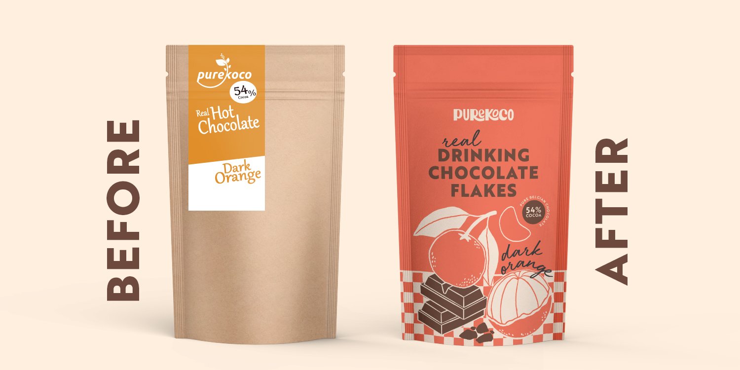
Purekoco is a personal project, inspired by a real-life product that I had bought over the internet. Although the product was amazing, I found the packaging a little lacklustre, so I wanted to do the brand justice by creating a whole new look and feel. In this project, I look at logo design, packaging and a custom-designed mailer box.

When starting the rebranding process, I first delved into Purekoco’s existing website, picking up on vocabulary, tone of voice and imagery to better understand the client. Words such as “decadent”, “luxurious” and “real” featured heavily in the descriptions, showing off the client’s true passion: it was clear they had the urge to put tasteless cocoa powder in the past by calling for the return of the Parisian style hot chocolate.
I followed this up by creating two customer profiles:
1. A non-tea/non-coffee drinker, who enjoys hot chocolate all year round and favours quality over quantity
2. An adventurous, self-indulgent drinker, who enjoys novelty flavours
After that, I created a mood board for style direction, focussing on typography, pattern and illustration for the packaging.
Finally, it was time to start the project by giving the brand a new logo. By combining my research and customer profiles, I worked on the idea of “modern hot chocolate”, expressed through bold and playful lettering, with a hint of nostalgia, from when hot chocolate used to be so much more than just cacao powder.


The patterns were inspired by the different weaving motifs found on traditional Parisian cafe chairs.


